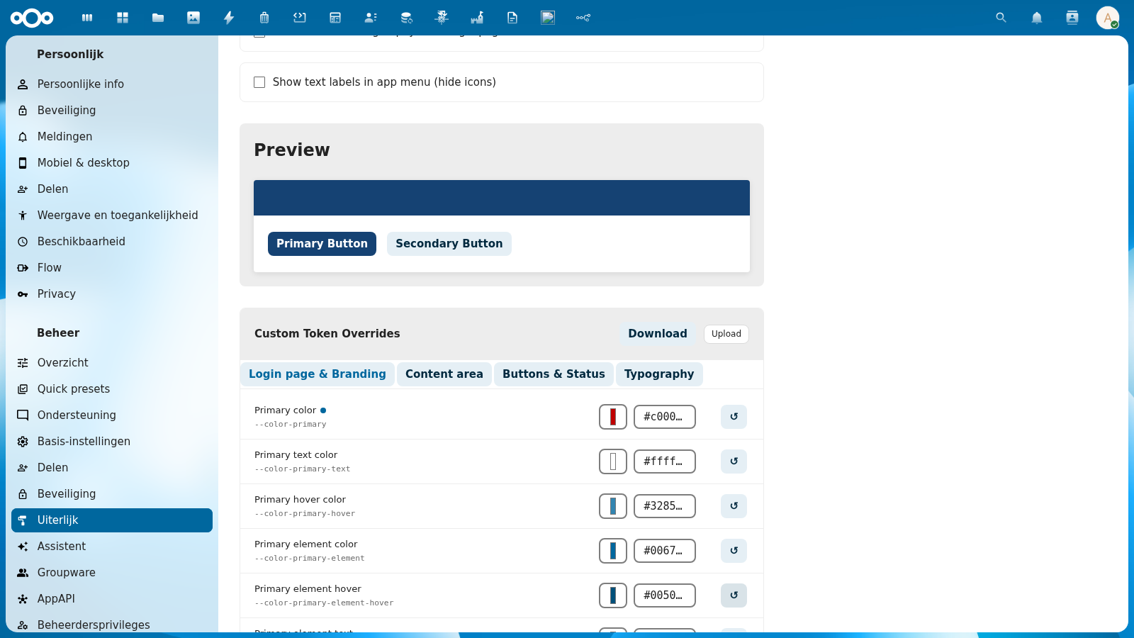
Token Editor
The Custom Token Overrides section in the admin settings lets you fine-tune individual Nextcloud CSS tokens independently of your selected token set. Overrides apply as a live preview instantly, and are saved persistently when you click Save overrides.
Overview
The token editor is located in the NL Design System Theme section of the Appearance admin settings. It consists of:
- 4 category tabs grouping the 53 editable tokens by area
- Per-row editing with a color picker, hex input field, and reset button
- Custom value badge indicating which tokens have been manually overridden
- Save overrides button to persist all current values
Category Tabs
Tokens are grouped into 4 tabs. Click a tab to switch between categories. The active tab is highlighted.
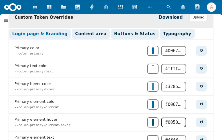
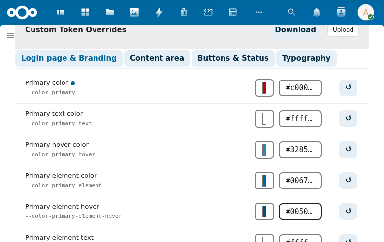
Login Page & Branding (12 tokens)
Controls the primary brand colors used throughout the interface — buttons, links, highlights, and the login page header.
| Token | CSS Variable | Description |
|---|---|---|
| Primary color | --color-primary | Main brand color for buttons and accents |
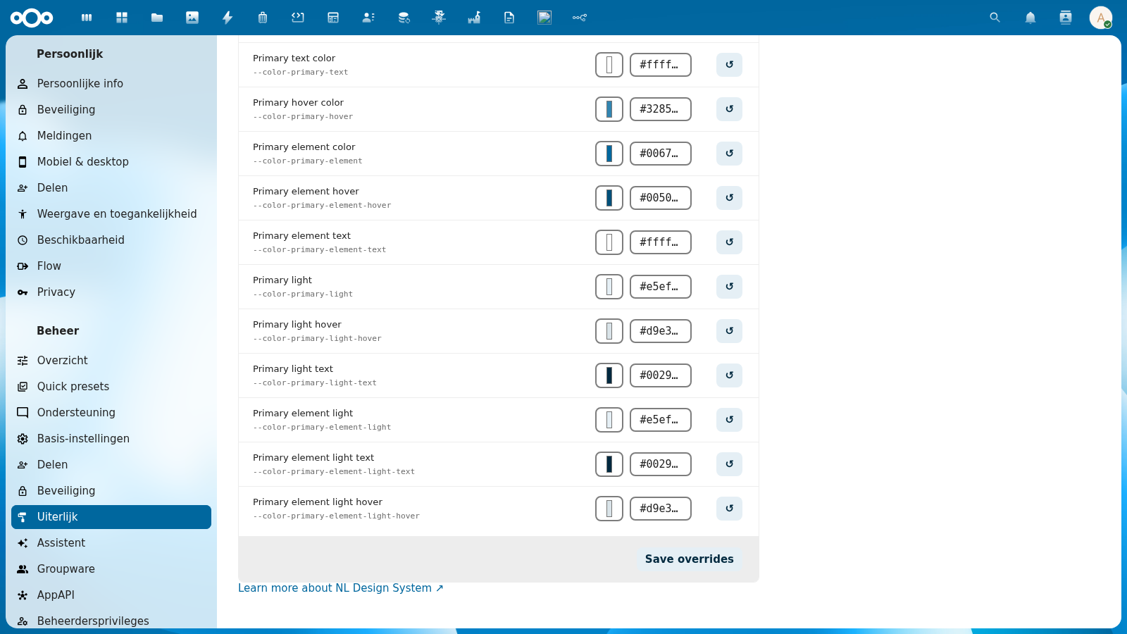
| Primary text color | --color-primary-text | Text on primary-colored backgrounds |
| Primary hover color | --color-primary-hover | Hover state for primary elements |
| Primary element color | --color-primary-element | Color for active/selected elements |
| Primary element hover | --color-primary-element-hover | Hover state for primary elements |
| Primary element text | --color-primary-element-text | Text on primary elements |
| Primary light | --color-primary-light | Light tint of primary color |
| Primary light hover | --color-primary-light-hover | Hover state for light primary |
| Primary light text | --color-primary-light-text | Text on light primary backgrounds |
| Primary element light | --color-primary-element-light | Light element color |
| Primary element light text | --color-primary-element-light-text | Text on light element backgrounds |
| Primary element light hover | --color-primary-element-light-hover | Hover state for light elements |
Content Area (18 tokens)
Controls background colors, borders, and border radii — the structural appearance of the interface.
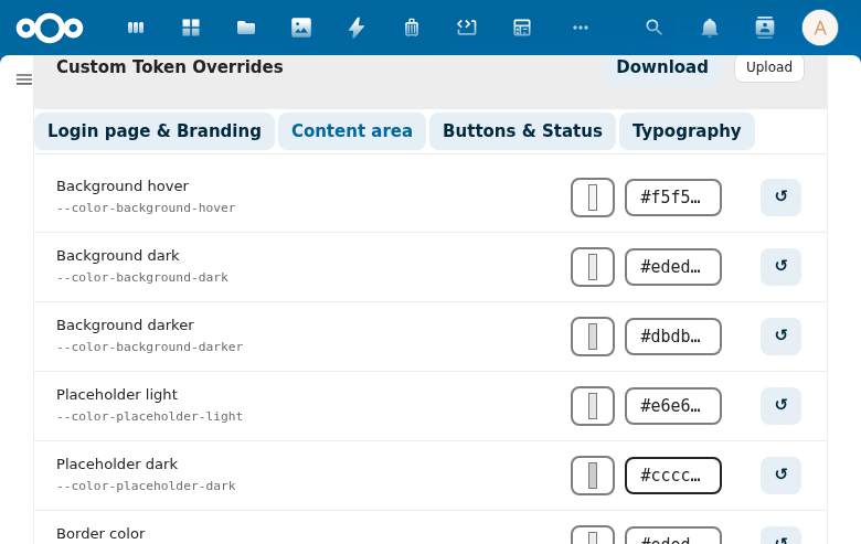
Covers: main background, dark/darker backgrounds, placeholder colors, border colors, border radius values (small, element, body container), scrollbar color.
Buttons & Status (15 tokens)
Controls error, warning, success, and info state colors — used in alerts, status badges, validation messages, and notification banners.
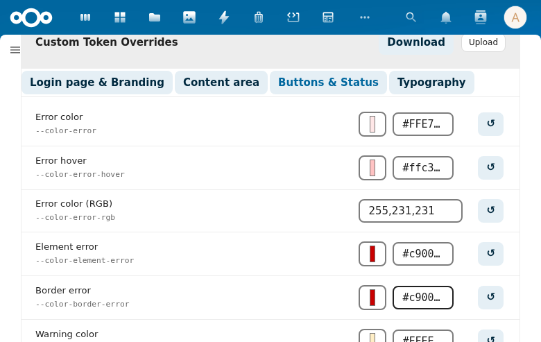
Covers: error color/hover/RGB/element/border, warning color/RGB/element, success color/RGB/element/border, info color/element, and favorite star color.
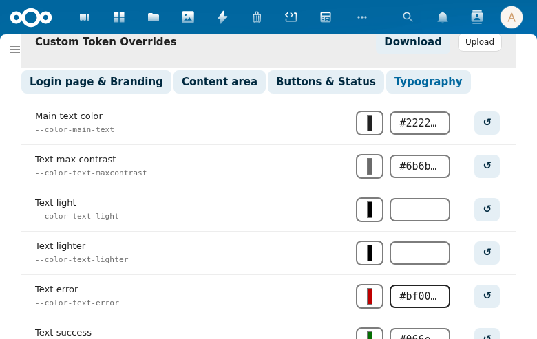
Typography (8 tokens)
Controls text colors and the font family stack.
| Token | CSS Variable | Description |
|---|---|---|
| Main text color | --color-text | Primary body text color |
| Text max contrast | --color-text-maxcontrast | Maximum contrast text (accessible variant) |
| Text light | --color-text-light | Light/inverted text |
| Text lighter | --color-text-lighter | Lighter secondary text |
| Text error | --color-text-error | Error state text color |
| Text success | --color-text-success | Success state text color |
| Text warning | --color-text-warning | Warning state text color |
| Font family | --font-face | Full font family stack |
Token Row Layout
Each token row contains:
- Token name — human-readable label (e.g., "Primary color")
- CSS variable — the actual CSS custom property name (e.g.,
--color-primary) - Color picker — click to open a native color picker (color tokens only)
- Hex input — type a hex value directly (e.g.,
#c00000) - Reset button (↺) — reverts the token to the value from the current token set
The color picker and hex input are always in sync — changing one updates the other instantly.
Custom Value Badge
When a token has been manually overridden (saved to custom-overrides.css), a small colored dot badge appears next to the token name.
The badge color matches the overridden value, making it easy to identify which tokens have been customized at a glance.
Clicking the reset button (↺) removes the override and the badge disappears — the token returns to the token set's default value.
Live Preview
Every change you make is applied immediately as a CSS variable override on the current page — you can see the effect instantly in the Preview section above the editor (shows sample primary and secondary buttons).
The live preview is not saved until you click Save overrides. Reloading the page without saving reverts all changes.
Saving Overrides
Click Save overrides at the bottom of the token editor to persist all current values.
On save:
- Only tokens that differ from the token set's defaults are written to
custom-overrides.css - Tokens at their default value are excluded from the saved file
- A success toast notification confirms the save
The saved CSS file is served at every page load, so overrides persist for all users and survive browser refreshes.